Warby Parker S-1: Problems with one of their customer disclosures

Warby Parker, one of the pioneers of the digitally native vertical brand movement, has been all over popular media lately on news of its upcoming public offering. One thing we were very happy to see was that Warby disclosed a significant amount of customer-related data in their pre-IPO prospectus. This is a testament to their transparency and a signal that their unit economics are healthy… and it also arms us with more than enough raw material to carry out a Customer-Based Corporate Valuation analysis (more soon from us on this!).
One of the more interesting customer-related data points that Warby disclosed came in the form of a cumulative customer acquisitions chart (i.e., the total number of customers acquired over time), going all the way back to their inception. Wow! While most people would brush this off as just another “up and to the right chart,” we saw it as an informational goldmine, because it would give us “for free” the total number of customers Warby Parker acquired every single year since they first began commercial operations. This would enable us to pin down a model for the flow of customer acquisitions with a high level of confidence.
More fundamentally, however, it is the only chart Warby Parker disclosed that provides financial information all the way back to their inception. This provides us with a significant amount of data about their early history. As an emerging growth company, they are only required to disclose two years of financial data, so to be able to get a view of what they have done over the past 10+ years is extremely valuable. For example, if they grew very slowly for most of their history, then exploded in growth over the past few years, we would have a very different impression of the business than if they steadily grew, year after year, since commercial operations began.
This is the chart from their S-1 filing:
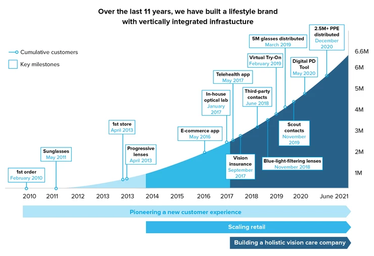
Given a chart like this, what we would typically do is back out period-by-period customer acquisitions (by counting pixels if necessary), fit our customer acquisition model to that data, and use the fitted model to project what future customer acquisitions will be. That customer acquisition forecast is a key driver of future revenues and thus overall valuation.
Look more carefully at that chart, though. Do you spot anything that seems off about it?
As we looked more and more closely at that chart, more and more issues emerged, leading us to believe that the chart is, quite frankly, incorrect. All told, we identified not one, not two, but five different errors in the chart.
This is a big deal. If this chart was purely illustrative, we wouldn’t be writing this post at all. But as noted above, knowing the evolution of customers acquired over time is very material. Even Warby implicitly acknowledges this – they separately disclose year-by-year customer acquisitions when they disclose their new versus returning active customer mix later on in the filing. This chart claims to represent cumulative customers and has actual numbers on it, so investors should be able to take the chart at face value – it should be correct. The S-1 isn’t a random investor presentation on a website – it is filed with the Securities and Exchange Commission and the data contained within it should be accurate.
To make these issues easier to see, we have included the original chart with our annotations summarizing the issues in red:
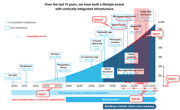
Let’s unpack these issues one by one (issue numbers above correspond to bullet point numbers below):
- The 2013 label is repeated on the x-axis, while the number of customers acquired continues to exponentially grow from the first 2013 to the second. Aside from just being sloppy, this issue alone proves that the chart cannot be correct. If one of those 2013 data points was correct, the other would have to be incorrect.
- The spacing on the x-axis is also problematic in two different ways:
- The “Key milestones” boxes seem to be spaced inaccurately, as if someone simply eyeballed the placement. For example, the distance between the February 2019 box and the March 2019 box is exactly the same, as measured through pixels, as the distance between March 2019 and November 2019. However, the former two are one month apart, and the latter are eight months apart.
- The spacing at the end of the chart is inconsistent with the spacing in prior years. Specifically, if the spacing for every other year was consistent throughout the entire axis, June 2021 is more than 6 months after the end of 2020, and the chart would run through the middle of 2022 instead of ending in June 2021. In other words, we do not have confidence that the passage of time is accurately conveyed through the x-axis.
- The vertical spacing of the y-axis also appears to be inconsistent. This inconsistency implies that the chart doesn’t start at 0, but rather at approximately 300K. If true, then the growth implied by this chart is steeper than is actually the case, had the chart started at 0.
- Although the S-1 stated that COVID pandemic has had a “material adverse impact” on the business, the customer acquisitions curve tells a different story. The transparently highlighted portion of the chart seems to show that acquisition maintained exactly the same trend before, during and after COVID, which means that there was no slowdown whatsoever during the worst months of the pandemic. However, based on the active customers data and active customer mix percentages disclosed in the filing, we know that customer acquisitions did indeed decrease from 1.1M in 2019 to 1.05M in 2020. Thus, the chart contradicts not only our expectations but also other data and discussion points made in the S-1.
Because of these problems, we decided to only trust hard numbers and disregard the shape of the acquisition trajectory completely – we ended up using acquisition numbers of the tables as well as total cumulative additions (6.6M) to fit the model rather than using the entire history of customer acquisitions. Our solution is workable, but there would have been material benefits if all the incremental data points were available and trustworthy.
We would like to emphasize that this doesn’t mean the company has underlying issues with their unit economics – we don’t believe the company is hiding something. What was the reason for this? Who knows, maybe the banking associate staffed on the deal had a late night and started to cut some corners to wrap this up. All this being said, these issues are big enough, and the underlying financial data involved material enough, that we would recommend that Warby Parker re-file their S-1. It wouldn’t be the first time. As we had spotted earlier, DoorDash disclosed a new customer mix chart that contained an error and had to re-file its IPO paperwork to fix it. Given the magnitude of the error here is arguably even more severe than it was in the DoorDash chart, we would recommend that Warby Parker refile their S-1 to correct the issue as well. Customer disclosures provide material and highly valuable information to the investment community. It is important to include them, but if we do, we must make sure to do it right.
Update: on September 29, 2021, Warby Parker updated the chart and fixed the issues we described in our post.